
Australian Anti-Corruption Certification
ui/ux design
case study
Searching made Simple.
Finding things can be frustrating. This was definitely the case when I started tackling the Australian Anti-Corruption Certification (AA-CC) web app. Searching on the platform was incredibly confusing. So how did I re-design the product and take the search experience from frustrating to, dare I even say, fun?
Creating Commercial Trust.
First things first. What is Australian Anti-Corruption Certification (AA-CC)?
AA-CC was born out of the idea that how we conduct ourselves matters. This was easy when humanity operated in small communities where your reputation spread quickly. Times however have changed. Thanks to the internet it’s far easier to connect with other businesses than ever before. But what about connecting with trustworthy ones? Honest ones? Ethical ones?
AA-CC began as an idea to solve this problem. It was conceived as a central, searchable listing database of businesses who are free of corruption, fraudulent activity, criminal activity or bribery.
The Problem.
Unfortunately AA-CC was rushed to launch to meet accompanying media deadlines. No meaningful user research and testing was carried out. It resulted in a cumbersome web application that wasn’t intuitive to use and ultimately failed to gain significant traction and a loyal user base.
The challenge we were tasked with was redesigning the application to meet users key needs and provide a simple user experience.
My Role.
I led the redesign of AA-CC as the sole designer. I was responsible for planning and carrying out all user research, analysis, wire framing, prototyping, testing & visual design. I worked with a project manager throughout this time.

Plan to Tackle the Problem.
At this stage I had two goals. First I wanted to discover users key needs in this problem space. The second was to uncover how usable the AA-CC web app was. To tackle this I developed a Research strategy with a clear goal, research questions and methods.
To streamline this case study we’re going to jump to the results of our testing and research. If you want to take a deep dive into the research itself click on the button ‘My Research & Testing’.
Usability Testing Results.
Usability testing brought up several issues. The most pressing and severe was the search functionality.
Unintuitive Search Functionality
Users really struggled with the search functionality as it wasn’t intuitive and prioritised searching for categories users were unfamiliar with such as ‘Certification number’ and ‘ABN.’


How might we.
The insights from our research presented a number of key design opportunities. In this case study I’ll be focusing on one of these in particular:

How users search.
From the research it became apparent that users largely fell into two different categories when searching for the right business.
Persona 1 - The Business Owner
The first were those who knew which business they were looking for. In that case they wanted to search for a business name.

Persona 2 - The Home Renovator
The other scenario was when a user wanted to look for a company that could help them with a particular service. Say they wanted a plumber. What they wanted to search for was a plumber located close to them. So they wanted ‘Industry’ and ‘Location.’

Creating Task Flows
This knowledge enabled me to re-design the task flows as they related to the search experience. This allowed me to improve the experience for the main user types whilst also providing alternate options for minority use cases.

Sketching & Wireframing.
During the ideation stage I was presented with a number of key design decisions and challenges that I needed to work through. Lots of crucial questions came up. Where should the search input fields be placed on the screen? How many input fields should be used? Should they all be presented at once, or should the search process be staged? How should autocomplete work? What happens if there are no results?

Sketching & wireframing was a great way to work through these vital design decisions. If you want to specifically look at these in more detail please press the ‘Explore Key Design Decisions’ button.
Prototyping.
At this stage I created higher fidelity prototypes so that I could conduct user testing.

User Testing.
I conducted two different in-depth moderated usability tests, one for Desktop and another for Mobile.
Testing Results & Iterations.
Users had trouble refining search on Mobile
Users didn’t understand they could press the ‘Search’ icon to edit their search options and instead expected to have to go to the home page and re-search from scratch. To overcome this problem I added a field which allowed users to edit on the search results page.

Some users wanted to search for Business name & Location
I made the assumption based on attitudinal research (interview & card sorting data) that people who searched for a specific business name e.g. Lidoran would only search for the business name and not worry about the location. However this proved not to be true in some cases. I still wanted to provide a way to streamline searching for businesses as I knew this was still a key need. I did this by adding business profile links to the autocomplete search function. This meant people could skip entering the location.

Other Issues
Some other great insights came up during testing but were less severe issues and could form the basis for future iterations, features and improvements:
-
People wanted a clearer understanding of the location of companies in relation to themselves.
-
People wanted some more information about companies at the search results level so they can make informed decisions before selecting a particular company.

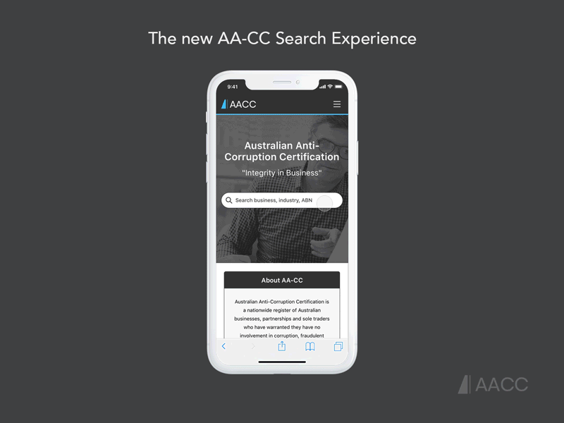
Introducing
The new AA-CC Search Experience
Desktop.
The Desktop design consists of two input fields that allow for simple yet powerful search combinations. Data can be entered in flexible formats (i.e. suburb, city, postcode) so as to not punish the user or force them to enter data rigidly and robotically. Finally the autocomplete function not only speeds up the search process but reduces user errors such as typos and reinforces the different search categories the user has at their discretion.
Mobile.
Fast search for checking a Business
The Mobile search experience is staged. This speeds up the process for users who want to perform a background check on a particular business as they only need to search for the businesses name. In most of these cases wanting to add the location is redundant.
Flexible search for Finding the Right Business
Users who are after a particular service go through both stages of the search process. They first need to find the industry they desire before being able to select the relevant location.
You can also see the advantage of a dedicated search page where the search bar is at the top. Here the extra screen real estate allows for more autocomplete suggestions. This minimises typing on Mobile which is notoriously difficult.
Quickly edit your Search
Users can easily and quickly edit aspects of their search, for example, in order to refine their search location. This saves users from having to search from scratch completely.
All the Business info you need
Having a great search experience is meaningless if you can’t find all the information that you’re looking for. I designed Business profile pages that prioritise key information that users care about.
Pixel Perfect Design.


Grid System.

Results & Reflections.
Unfortunately due to the COVID-19 development the project has been put on hold.
I’m optimistic that once the re-design is implemented and carried out it will have significant positive repercussions from an analytics point of view.
The user research & testing itself has been invaluable for pushing the product forward. A lot of false assumptions that underlined certain parts of the project have been overturned. This of course brings up new design challenges and directions the project will need to explore to continue to better meet users key needs.
Personally it has been a great learning curve. I’ve been constantly reminded that research, testing & iterating are the foundation for any product venture.