AA-CC Appendix
Data, Analysis + other boring info

Welcome.
Why the Appendix you ask? In order to keep the Case Study somewhat readable, I decided to cut a lot of the less exciting stuff. Most of this includes my user research + testing plans, as well as the corresponding data and analysis. Peruse as much or as little as you would like.
Execution Incomplete.
Unfortunately AA-CC was rushed to launch to meet accompanying media deadlines. No meaningful user research and testing was carried out. It resulted in a cumbersome web application that wasn’t intuitive to use and ultimately failed to gain significant traction and a loyal user base.
The challenge we were tasked with was redesigning the application to meet users key needs and provide a simple user experience.
My Role.
I led the redesign of AA-CC with the occasional help & feedback from another designer at our agency. I was responsible for planning and carrying out all user research, analysis, wire framing, user testing & visual design. I also worked with a project manager throughout this time.
Plan to Tackle the Problem.
At the beginning of the project there was very little data available. I knew that we would need to quickly determine the usability of the existing product. To do this I would need to carry out user testing on the existing product and also conduct a Heuristic Evaluation. I also wanted to do some user research to validate the original problem space or to provide insight into new arrears the project could head.
For this I set out creating goals and a plan for both user testing and user research.
Usability Results.
There were several key usability problems identified with the existing product that needed addressing. Some of these were deemed urgent whereas others could be rolled out at a later time.
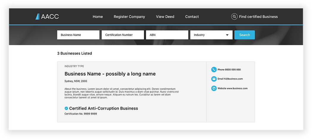
Unintuitive Search Functionality
Users really struggled with the search functionality as it wasn’t intuitive and prioritised searching for categories users were unfamiliar with such as ‘Certification number’ and ‘ABN.’
Confusion between Creating Account & Logging In
There were several key usability problems identified with the existing product that needed addressing. Some of these were deemed urgent whereas others could be rolled out at a later time.
01 Searching for a Better Search.
The Process
The first feature that needed a major redesign was the search functionality. We found that it was unintuitive, confusing and didn’t coincide with the users mental model.
How Users Search
It became clear that most users fell into one of two categories.
The first lot knew what business they were looking for and wanted to check if it was an ethically practicing company. In this scenario they wanted to quickly search ‘business name.’
***Almost a snippet from a User Journey Map. From Persona 1 & Persona 2.
The second were after a company that could deliver them a particular service e.g. ‘plumbing’. In this case they wanted to search for a particular ‘industry type’ or ‘service’ that was close to them.
Design Decision 1 - Where to place Search?
Design Decision 2 - Input fields
I knew that I needed to prioritise search categories such as 'Business name', 'Industry type', and 'Location' in order to match with the users mental model. But how would this look? How many input fields did I need? How should they interact?
Users really struggled with the search functionality as it wasn’t intuitive and prioritised searching for categories users were unfamiliar with such as ‘Certification number’ and ‘ABN.’
Ditched Rigid 2 input fields with industry cards underneath. Industry cards always limited to smaller number of industries. Design would limit growth of site.
Wireframes.

Home Page - Early Iteration.
Listings Page.

High Fidelity Designs.
Home Page.

Listings Results Page.
